Stoneybatter House Redesign
Information about the Stoneybatter House Redesign and Refurbishment project.

Here we see the original living room with small window which looked into an extension room.

The same room with high gloss floor tiles and enlarged window (with the former extension now removed). Glass doors to allow light to flow and to create a better sense of space.

The original front reception room. Basically, a forgotten and unused room.

New kitchen with fully integrated appliances, high gloss floor tiles and high gloss units with snack bar.

Original dark interior showing hall and front reception which was converted into a new kitchen.

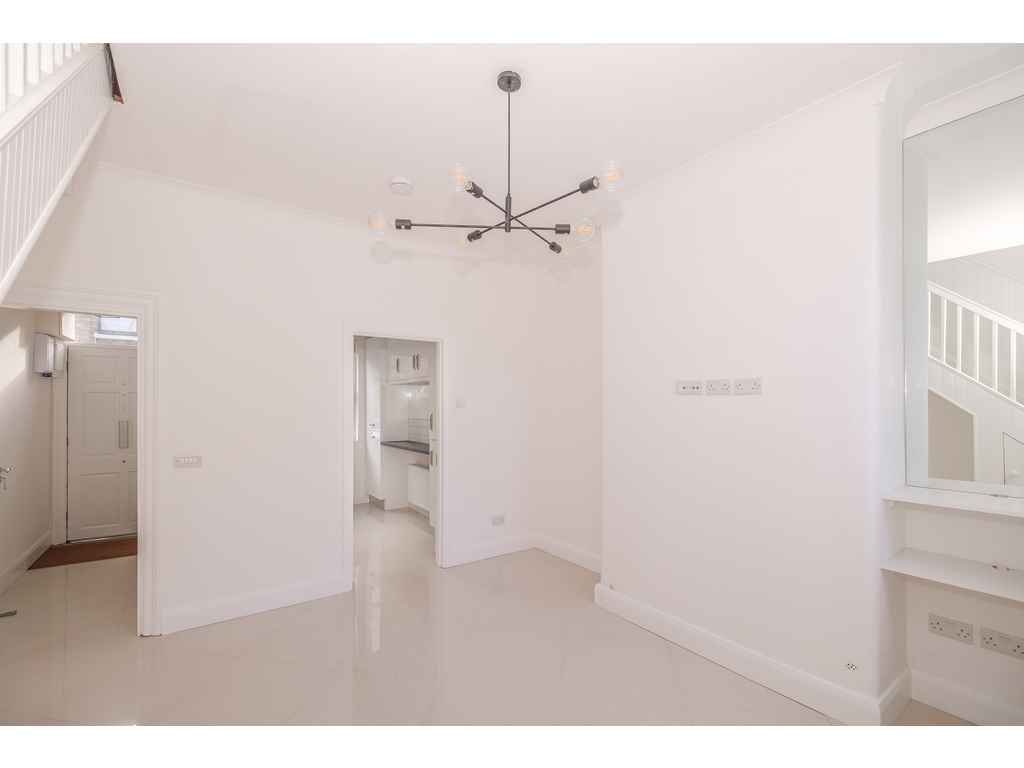
Overall view of finished room with view to hall and kitchen. Note mirrored recess to create depth and bounce light. Arguably not to everyone's taste but the original fireplace was removed for reasons of safety and maintenance where the property is to be rented to tenants.

This shows the first half of the large front, upstairs bedroom where a new shower room was to be installed.

Finished bathroom with concealed storage behind mirrored cabinets. The yellow embossed tiled wall creates a splash of colour for a bit of extra brightness. Two lighting options; the first with extractor fan and radio coming on automatically and the second with no noise for night time use. Marshall's "trademark" = 2 showers - the mains and the instant electric back up.

Original ground floor bathroom which was converted into a study / 3rd bedroom.

Newly created study / 3rd bedroom in location of previous bathroom. Highly insulated walls and overhead storage. To help create extra space the entry door now opens outwards.

Here we see part of the former kitchen where we subsequently located a new ground floor guest lavatory.

Completed new ground floor guest lavatory. Very simple, clean and bright.

Original stairs with honey-pine tongue and grooved panelling also showing dated doors and lighting.

Everything painted out - bright and white! Clean, simple and fresh. We also see the enlarged window - now looking out into natural daylight (instead of looking into the former lean-to extension where the orignal kitchen had been located). Pop of vivid green on the stair carpet. Well, one does need some colour!

Original entrance hall with heavy, dark woodwork on the floor and walls.

A much brighter, streamlined hall with clear glass doors (opening out from living room to create space) and not forgetting the sunken doormat - very practical.
_Web-08184588190abefa8af1c890c88502c5.jpg)
Simple city garden - ideal for the rental market. Showing clean, painted walls and low maintenance artificial grass. The former lean-to extension, which blocked light, is now gone revealing an enlarged living room window. The entire area simply finished with new plastered walls and patio. No fuss.

Another view of the low maintenance garden.

We needed some colour and this high quality, pure wool carpet in a "subtle" shade of green adds just enough!

Reduced size front bedroom but still big enough for a double bed, now with built in wardrobe and vertical (space saving) radiator. Low maintenance laminate floor and simple roller blind. No fuss.

Original back bedroom. While the feature fireplace was undoubtedly attractive, it took up too much valuable wall space and for safety - in the rental market - it was decided to remove this.

Simple room which can accommodate a double bed on the wall where the fireplace was originally located or on the opposite wall (behind the door).
